This project was created while I was studying abroad in Lacoste, France. The goal was to explore an aspect of French culture and design an expressive typography book and bookmarks based on the chosen theme.

/ Typography/ Book Binding/ Adobe Illustrator/ Adobe InDesignPhoto by gruber imagesThe Tour Through Time
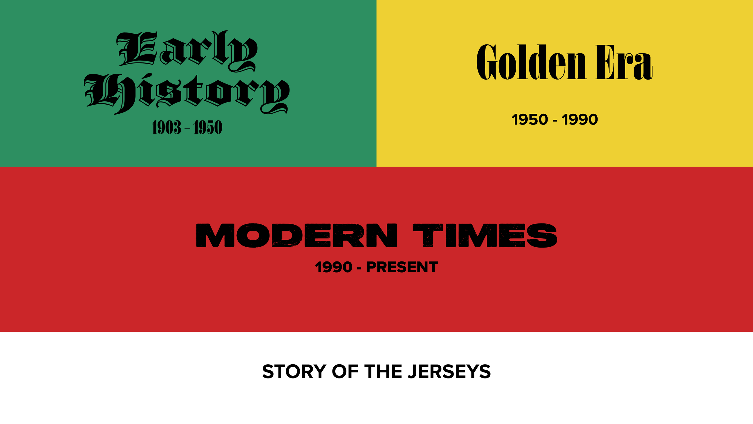
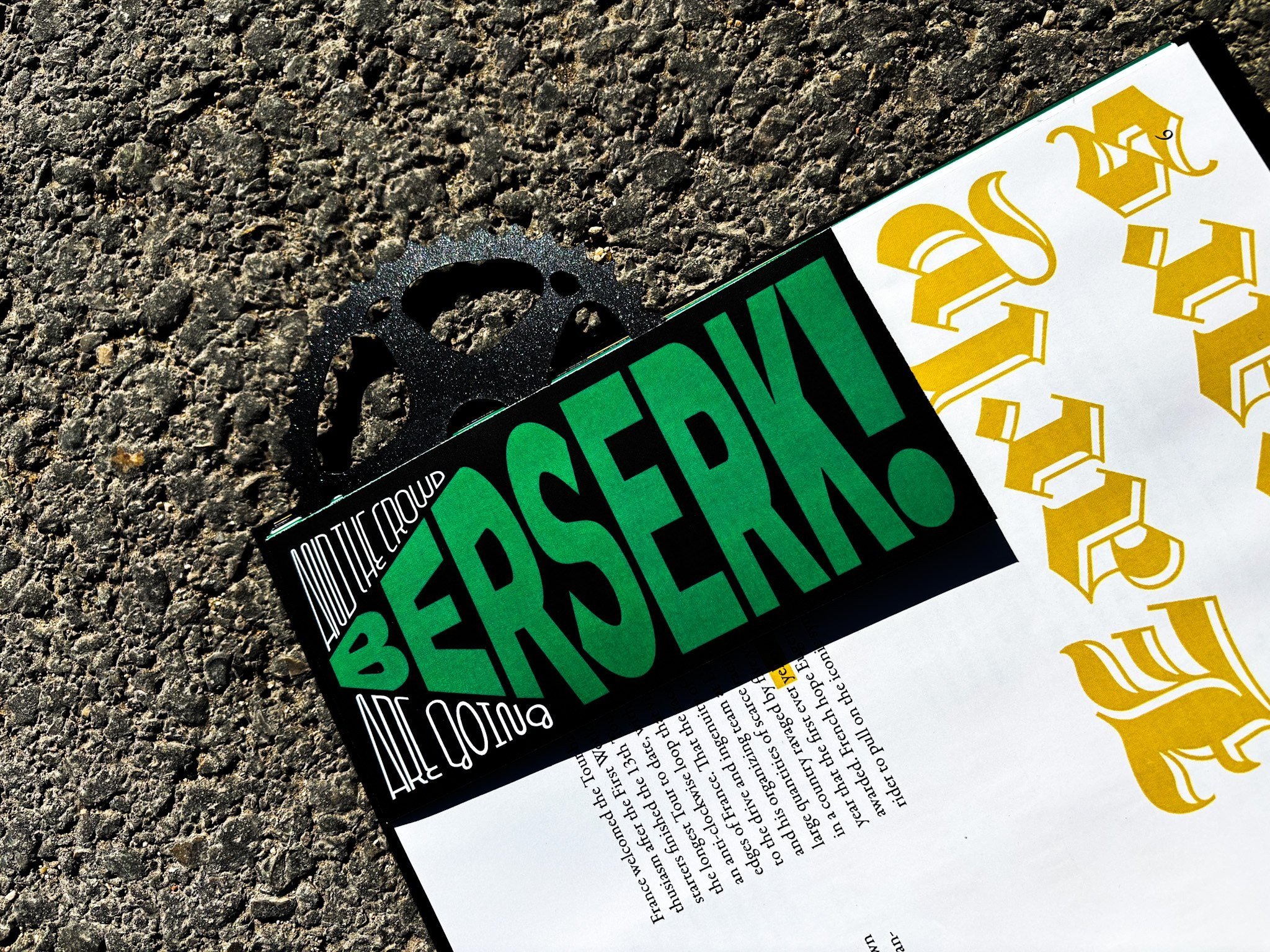
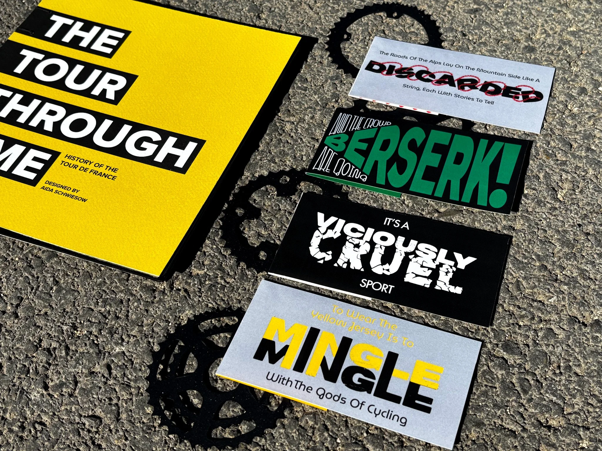
The book and bookmarks were designed to showcase the evolution of the Tour de France, a journey marked by its ups and downs. Since its beginning, the Tour has been a challenging and impactful event for both riders and spectators. Typography serves as a powerful tool of communication, and throughout this project, I used it to tell the story of the Tour’s grit and glory.

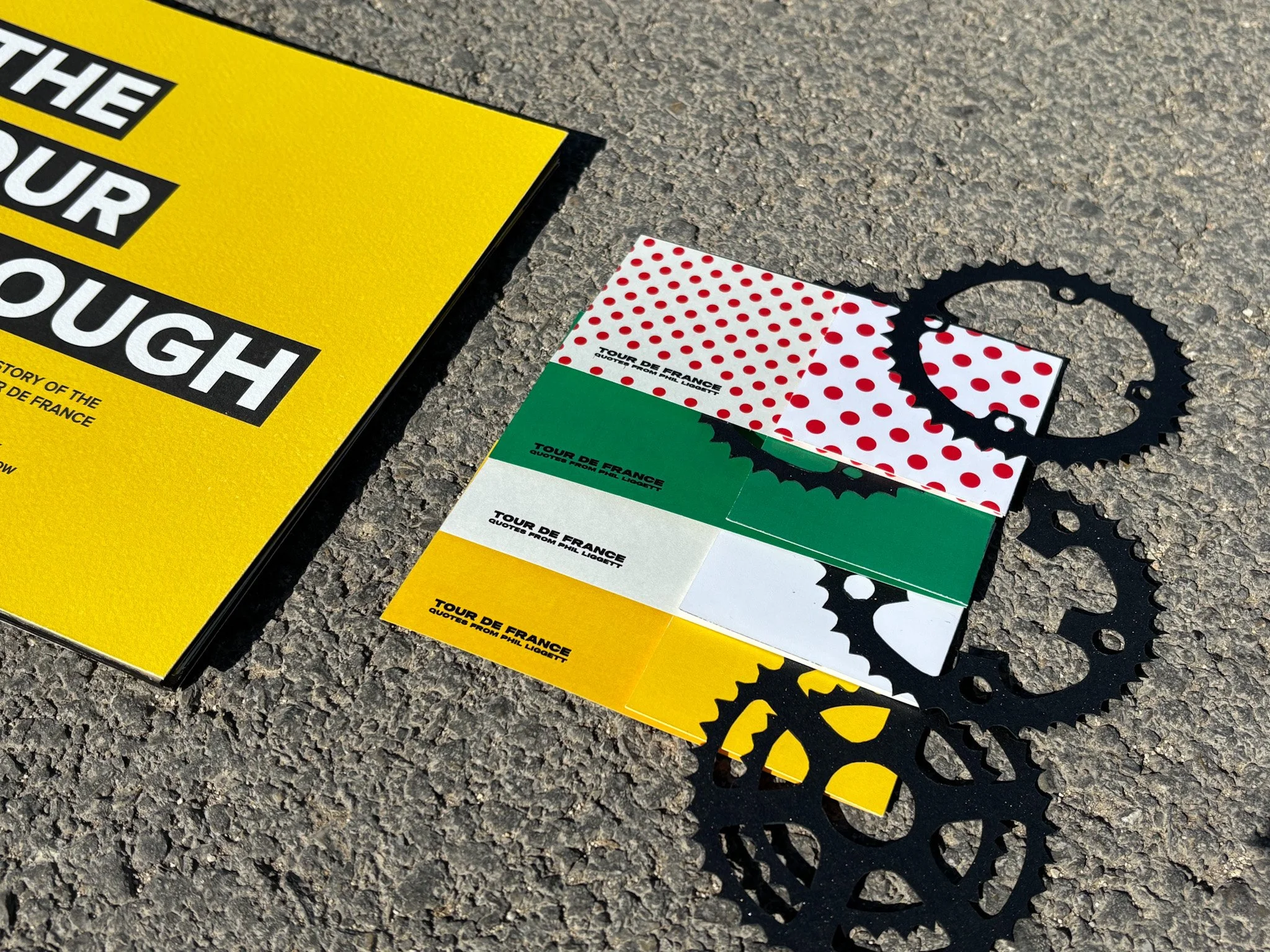
The content of the bookmarks is quotes from the famous commentator of the Tour, Phil Liggett.
Bookmark Ideation


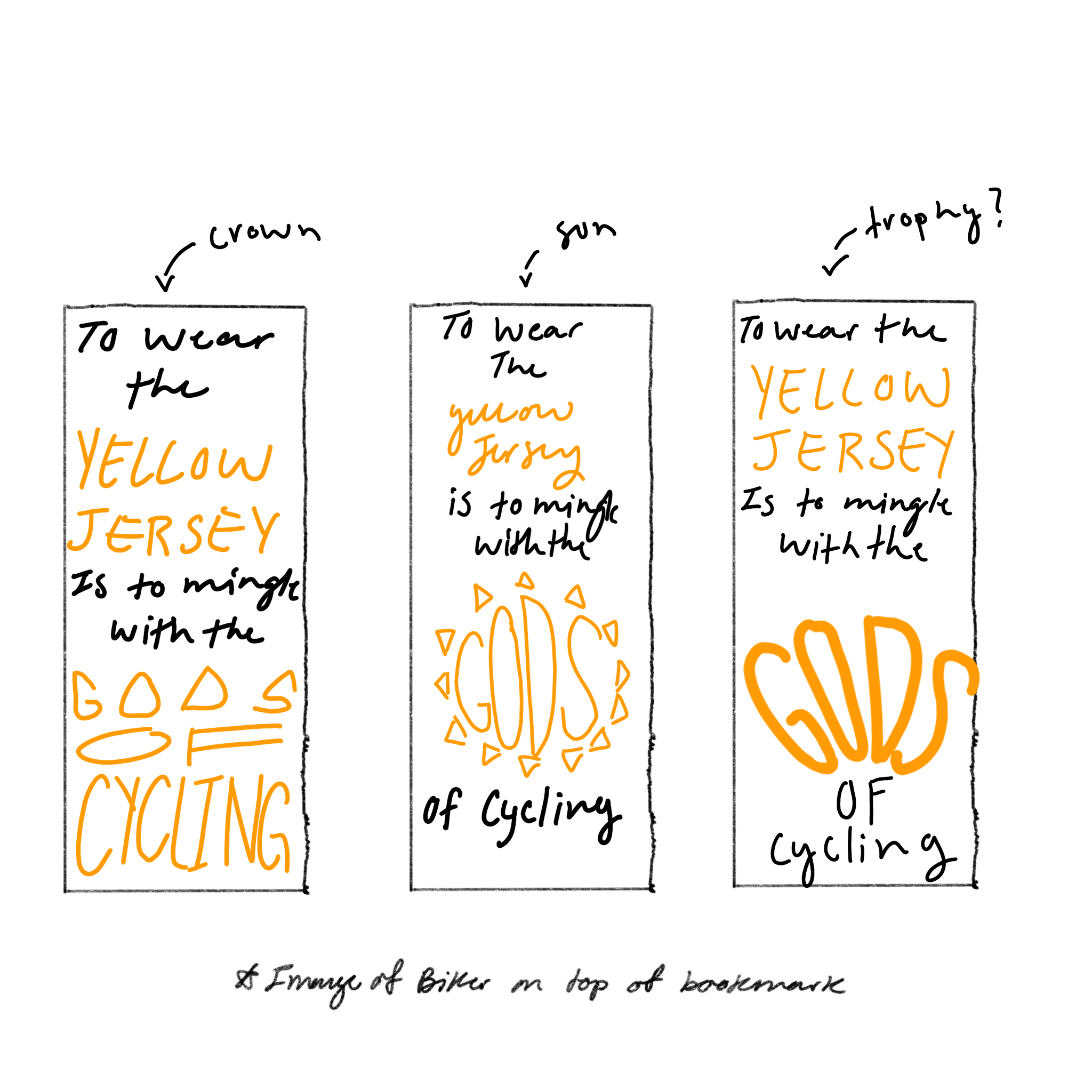


Each bookmark and quote represent a different jersey of the Tour. Green, white, polka dot, and yellow.
Bookmark Development


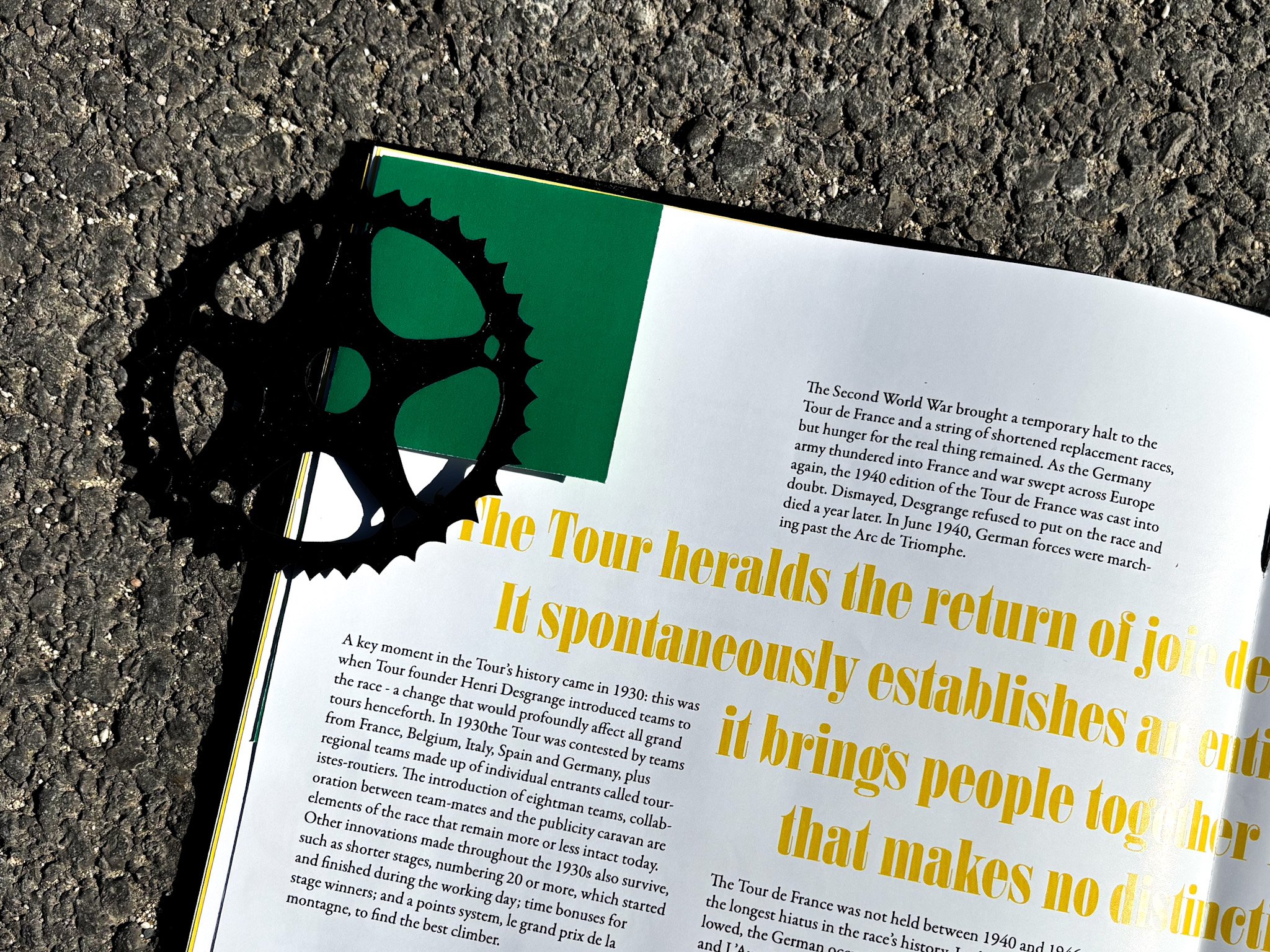
The typefaces used in this book were inspired by newspapers and advertisements of the tour, starting with the first edition in 1903.
The colors represent the four different jerseys of the tour, yellow, green, polka dot, and white. These four jerseys are the most recognizable symbol of the Tour.
Type and Color Selection